


My Designs
Album Cover | Flyer | Postcard | Textciting!Album Cover
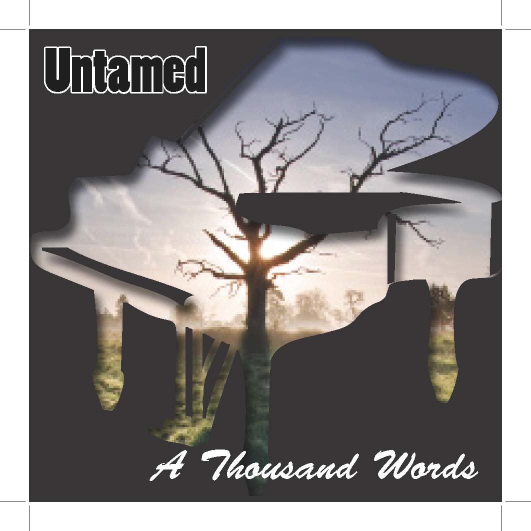
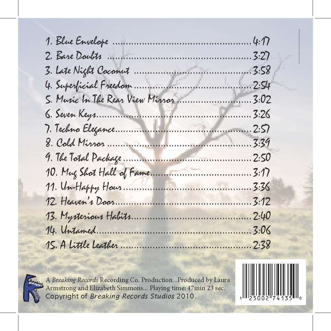
For the CD cover I chose to make it both artsy and visually appealing. I made the back ground black, and put black text for the name of the band and the album title. I named the band Untamed and the album A Thousand Words based off the saying “a picture is worth a thousand words”. I chose the texts that I felt fit accordingly with each of the two titles. I found a picture of a silhouette the instrument that is, fictitiously of course, the dominant instrument in the songs on the album, a piano. I used the clipping path tool to turn the image into a frame, and placed a very visually appealing and powerful picture. This image against the black background surely would draw the attention of a prospective consumer and with the added effects to the picture would be visually appealing. I chose to name the record company Breaking Records. For the logo of the album I chose to take advantage of the similarity of the beginning letters of the two words and connect them. I used the ‘type on a path’ tool to write along the shape of the letters and reflected it inside the letters in a contrasting color. I used different text styles for each of the words. This is because I felt that the word “breaking” was deserving of an edgier visual element than “records”. As for the back side of the CD cover, I took the same photo that I used inside the piano on the front to create a sense of unity with the two sides. I listed the songs on the album and used ‘tabs’ to create a style for the titles and times of each song. I placed the bar code conveniently out of the way on the bottom right corner and put the copyright and other record information along the bottom.
Click images to view larger
Flyer
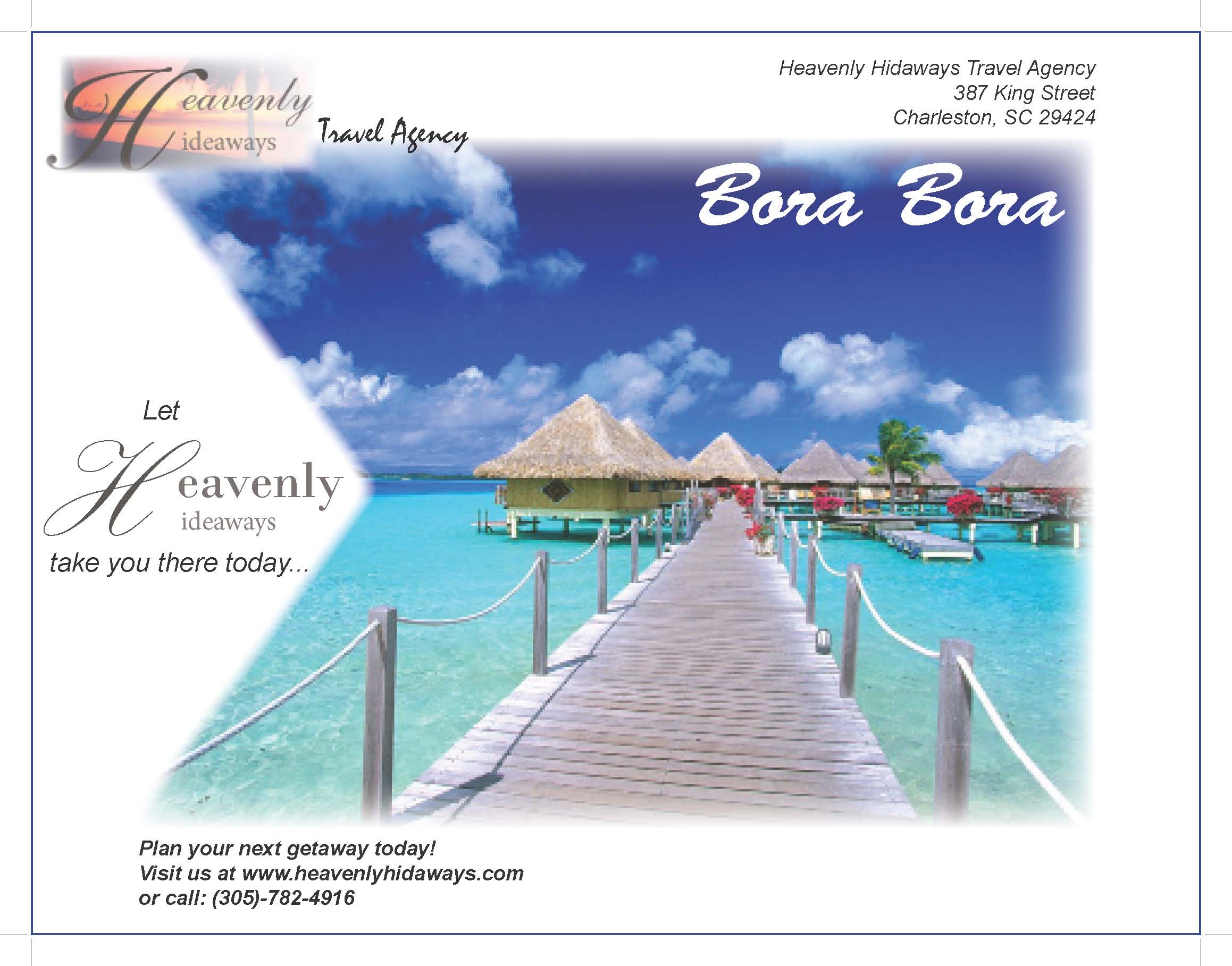
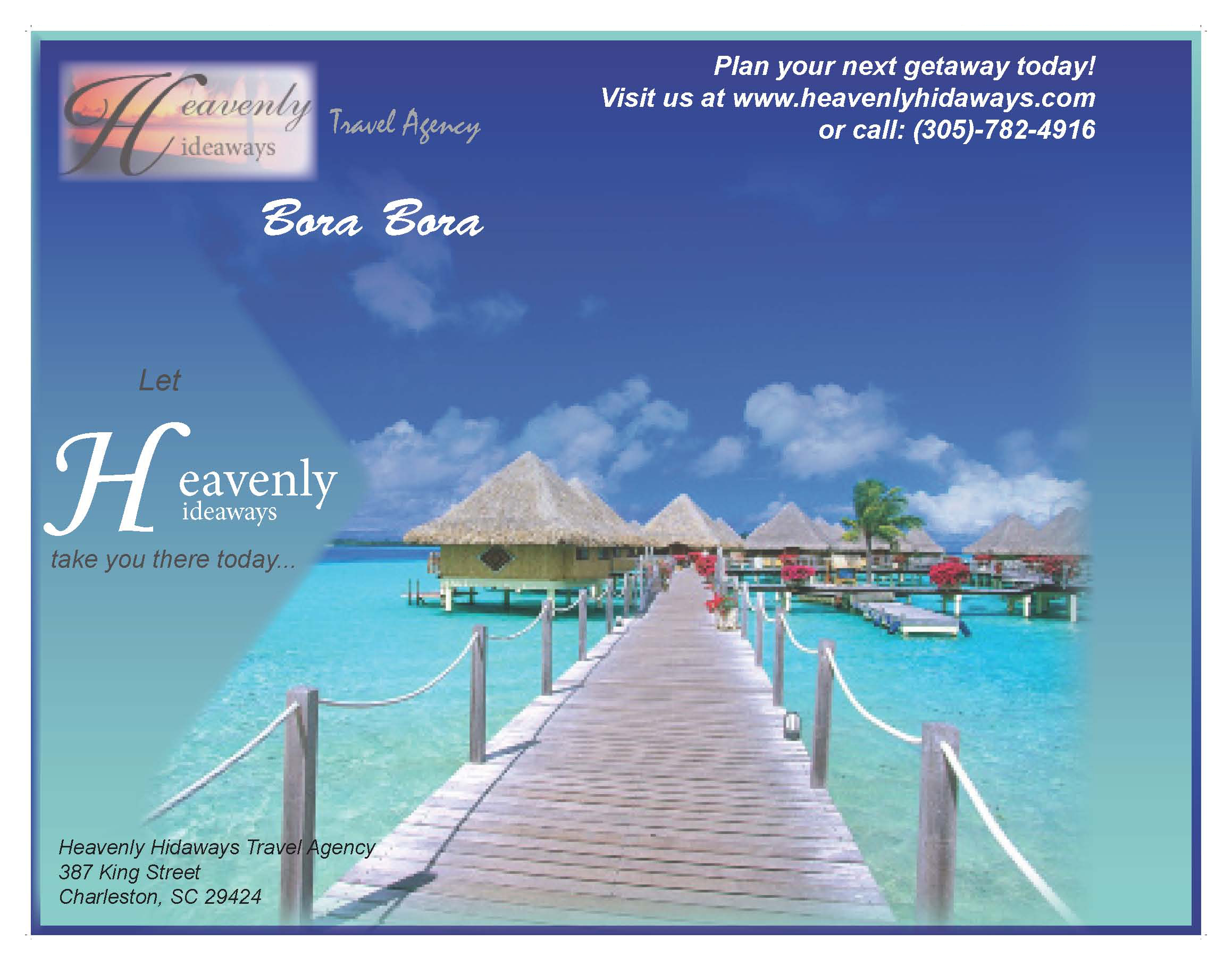
As a hypothetical business I chose a travel agency. I established the name of my company, Heavenly Hideaways Travel Agency, and from here I began to create my logo. The logo for my company has a photograph of the sunset on a beach, a very ‘heavenly’ scene. I put a fading transparency oh the picture and put the name of the agency in a very elegant text over the photograph. I placed the logo in the top left corner of the fliers because people generally read from top left to bottom right, so, other attention-drawing factors aside, this would naturally be the first place someone would look. Another thing that I did to draw attention to the logo and thus the name of the company is I chose a dominant picture that didn’t clash with the logo, but had contrasting colors so that the logo stands out. I also chose a very visually appealing picture and labeled the location at which the photograph was taken. The picture places the reader in the location by appearing as though you’re about to walk down the walkway over the ocean. I put a flag pointing towards the picture to add asymmetry and also to draw the eye in toward the middle of the page. On the flag I placed the text “Let Heavenly Hideaways take you there…”. I created a gradient background that consisted of similar colors in the picture and blended the photograph into the gradient so that the background was somewhat of an extension of the picture. I put a frame around the whole page that was the same gradient, but it was reversed so that the lighter blue was against the darker blue and vice versa.
Click images to view larger
Postcard
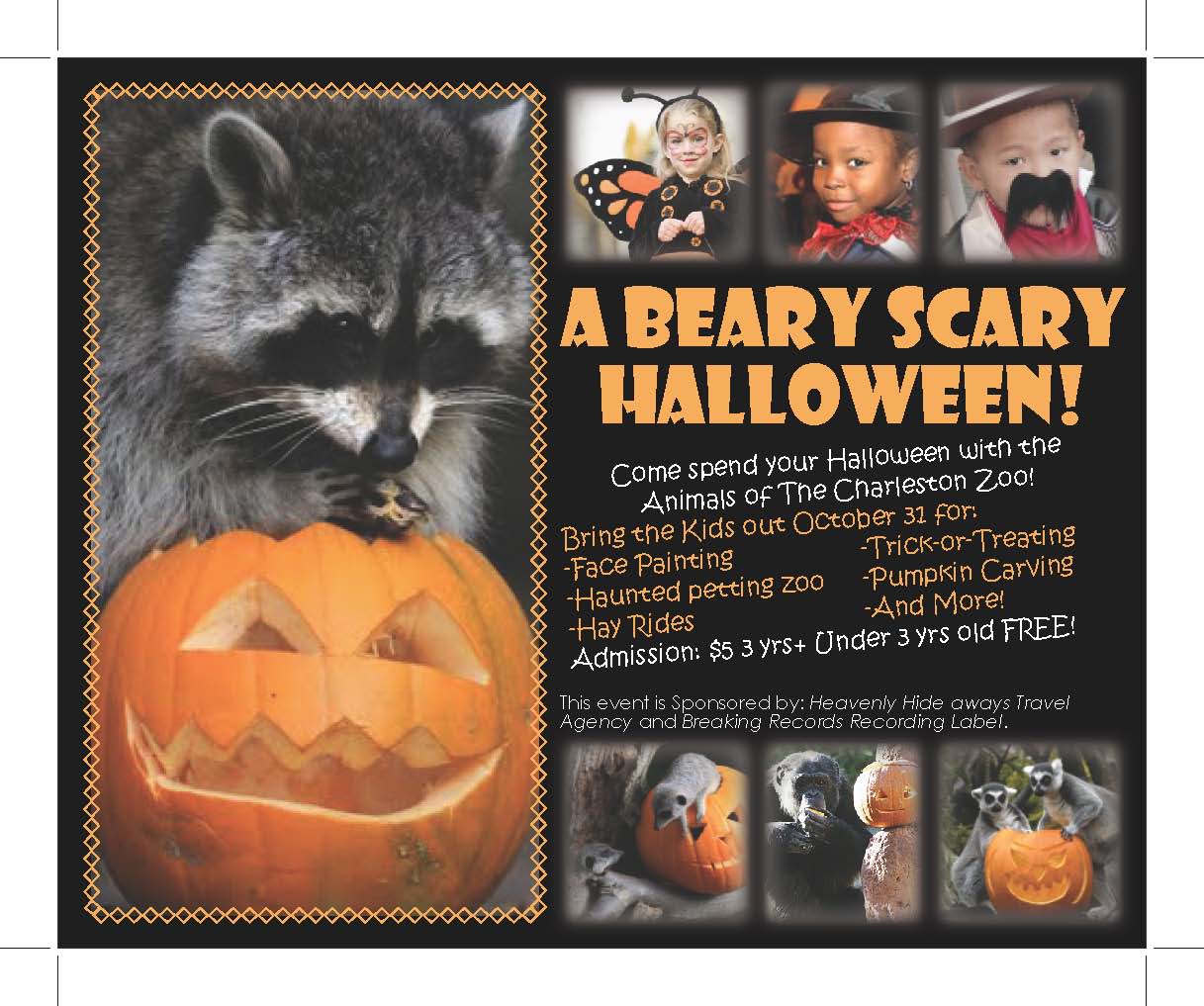
I chose to incorporate Halloween into my event. I happened across a picture of an animal with a jack-o-lantern, and decided to hold my event at a fictitious zoo. In the spirit of Halloween, I chose the classic colors for the holiday as my color scheme of my advertisement. My dominant picture is an adorable, but unexpected photo of a raccoon playing with and eating a jack-o-lantern. The purpose of using this obscure, but attractive and adorable image is to get people’s attention initially. I put a decorative frame around the dominant picture to add emphasis. I added three smaller pictures of animals with pumpkins for repetition, variation and contrast. I mirrored this same layout at the top of the page for added symmetry and balance. I put the same effects on these picture boxes as I did on the bottom ones to utilize balance, unity, and repetition. In these picture boxes I put pictures of children dressed up and trick-or-treating. I made the title of the event “A Bear-y scary Halloween” to mix the ideas of animals and Halloween. I put in the texts a list of activities that would be at the event and I also put pricing and other info including the sponsors, Heavenly Hideaways and Breaking Records. I put some text in orange and some text in white not only for contrast but also to separate different points and purposes of text.
Click image to view larger
Textciting!
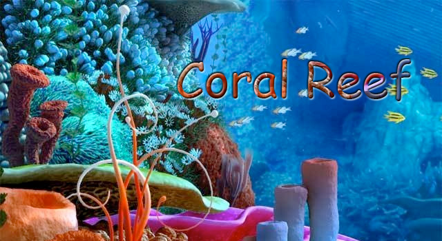
These are some fun ways to play with text in Photoshop. The first is a "type on a path" image, and the second is created using a method called "text masking".
Click images to view larger